Bij het maken van keuzes voor datavisualisatie en -analyse staan marketeers vaak voor een belangrijke beslissing: welke tool sluit het beste aan bij hun behoeften? Qlik Sense en Looker Studio (voorheen Google Data Studio) zijn twee veelgebruikte oplossingen die elk hun eigen aanpak hebben. Qlik Sense staat bekend om zijn krachtige analysemogelijkheden en flexibiliteit, terwijl Looker Studio zich onderscheidt door gebruiksvriendelijkheid en integratie met het Google-ecosysteem. Beide tools hebben sterke punten, in dit artikel bespreken we de verschillen.
Functionaliteiten en analysemogelijkheden
Met Qlik Sense kunnen gebruikers gegevens makkelijk vanuit meerdere kanten analyseren dankzij het slimme associatieve model. Met dit model kun je eenvoudig verbanden vinden tussen verschillende databronnen en patronen ontdekken die in standaardanalyses vaak over het hoofd worden gezien. Voor marketeers betekent dit dat je vragen zoals “Welke factoren beïnvloeden klantgedrag binnen verschillende segmenten?” of “Hoe presteren campagnes onder verschillende omstandigheden?” snel en diepgaand kunt beantwoorden.
Looker Studio richt zich meer op toegankelijkheid en gebruiksgemak. De gebruiksvriendelijke interface maakt het eenvoudig om rapporten en visueel aantrekkelijke dashboards te creëren, zelfs zonder het hebben van technische kennis. Het platform is ideaal voor teams die behoefte hebben aan snelle inzichten binnen het Google-ecosysteem. Looker Studio is voornamelijk gericht op rapportage in plaats van uitgebreide analyses. Hierdoor ontbreekt de diepgang die Qlik Sense wel biedt bij het omgaan met moeilijke datasets.
Integratie en ecosysteem
Qlik Sense kan eenvoudig worden gekoppeld aan verschillende databronnen en systemen. Dit maakt het een flexibele keuze voor bedrijven die met uiteenlopende soorten data werken. Of je nu gegevens uit CRM-systemen, ERP-software of externe databases wilt samenbrengen, Qlik Sense biedt de tools om alles op één plek te analyseren.
Looker Studio werkt vooral goed binnen het Google-ecosysteem. Het sluit perfect aan op tools zoals Google Analytics, Google Ads en BigQuery. Voor bedrijven die vooral met Google-producten werken, is dit dus een handige en eenvoudige oplossing. Maar als je data uit meerdere, niet-Google bronnen wilt combineren, kunnen de mogelijkheden beperkter zijn.
Gebruiksvriendelijkheid en leercurve
Looker Studio is makkelijk te gebruiken en daardoor perfect voor teams zonder veel technische ervaring. De eenvoudige interface maakt het mogelijk om snel rapporten en dashboards te maken zonder ingewikkelde instellingen. Dit maakt het een toegankelijke keuze voor marketeers die snel inzicht willen krijgen in hun data.
Qlik Sense is wat lastiger om onder de knie te krijgen, maar biedt veel meer mogelijkheden voor diepgaande analyses. Na een leerperiode kunnen gebruikers complexere data analyseren en waardevolle inzichten ontdekken. Voor marketeers die bereid zijn tijd te investeren in training, kan Qlik Sense daarom een betere keuze zijn op de lange termijn.
Complexiteit en maatwerk met NXTLI dashboards
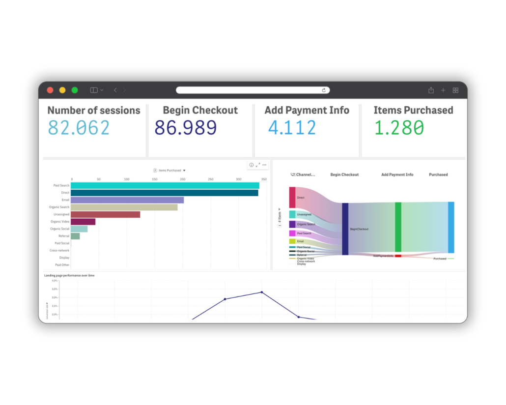
Het werken met een uitgebreide tool zoals Qlik Sense kan best ingewikkeld zijn, vooral als je veel verschillende databronnen hebt en specifieke bedrijfsdoelen wilt bereiken. Met NXTLI wordt dit een stuk makkelijker. Wij ontwikkelen dashboards die het maximale uit Qlik Sense halen, maar tegelijkertijd eenvoudig te gebruiken zijn. Door data uit verschillende systemen samen te brengen in één overzichtelijk dashboard, krijg je snel en makkelijk inzicht in de belangrijkste cijfers. Zo hoef je je geen zorgen te maken over de complexiteit, maar kun je je richten op het nemen van andere slimme beslissingen. Meer over deze dashboards kun je lezen op onze Next Level Dashboards-pagina.
Qlik Sense en Looker Studio zijn dus beide nuttige tools voor datavisualisatie, maar voor marketeers die op zoek zijn naar diepgaande analyses en flexibiliteit biedt Qlik Sense net wat meer mogelijkheden. Met de dashboards van NXTLI wordt de complexiteit van Qlik Sense omgezet in een duidelijke en praktische tool die helpt bij het verbeteren van jouw marketingstrategie.
Maak iedere week een sprong vooruit in je marketing AI transformatie
Elke vrijdag brengen wij je de meest actuele inzichten, nieuws en praktijkvoorbeelden over de impact van AI in de marketingwereld. Of je nu je marketing efficiency wilt verbeteren, klantbetrokkenheid wilt verhogen, je marketingstrategie wilt aanscherpen of je bedrijf digitaal wilt transformeren. ‘Marketing AI Friday’ is jouw wekelijkse gids.
Meld je gratis aan voor Marketing AI Friday.